The NuST web server requires as input data set a single column text file with one gene ID for each row.
Three sample data sets are given as an example of valid inputs. The sample zip archive contains the three gene lists and a README text file with information about the gene lists. These data sets can be uploaded and used to start the analysis and to test all the available analysis tools.
We considered as standard gene ID the gene name given by the Regulon DB database (http://regulondb.ccg.unam.mx
).
If a different gene ID
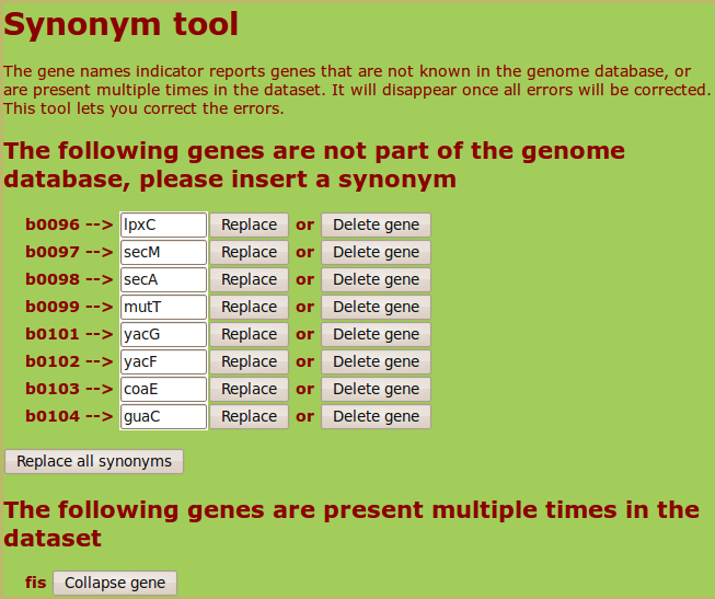
(as a Blattner ID) is present in the user list or if a gene ID appears multiple times, the web server will propose the possible synonyms for each non-standard ID
and give the user the possibility to eliminate possible redundancies. Here is an example of the output for a list containing eight Blattner IDs and
a repeated gene name:
The complete list of gene IDs with their chromosomal coordinates and the list of possible synonyms that the web server can recognize can be downloaded in the Downloads section.
After an input file has been correctly uploaded, the analysis can be directly started by clicking the links that automatically appear.
The loaded data sets are stored as personal data sets in the internal database described in section 2.2 and can be accessed during the session in the Explore page (menu on top of each page) for further analysis .
The personal data sets are deleted at the end of each anonymous session. If the user needs to keep the data for multiple session a login is needed. This can be obtained sending an email to the administrator (see the "Credits" section).
2.2 Explore the database
2.2.1 Common and personal data sets
The Explore page (which can be selected form the menu on top of each page) presents two different classes of data sets.
Personal data sets: This is the list of input files loaded by the user. The user can add his/her data sets and delete previously loaded ones.
Selecting the "Add" tab, three options are available:
The different options are described in detail below, in sections 2.2.2 and 2.2.3.
Common data sets: This part contains published data, which we collected in an internal static database, representing results from different experiments or external databases. Different tools implemented in the web server allow direct comparison of user-defined data sets with existing ones in this database.
Each data set has the form of a gene list and the data sets are organized in folders in relation to the types of biological data and the experimental techniques. All the information about the data sources, how gene list are extracted and the reference papers are shown when a data set is selected, by clicking on its name.
2.2.2 Add a data set of genes from file
A new list of genes can be added as a single column text file with one gene ID for each row. The accepted genes IDs are discussed in section 2.1. Each common data set can be taken as an example of valid input file (selecting the "Show data set" option in the page relative to each data set) or alternatively three sample data sets are given as further examples.
The loaded data sets are deleted at the end of each anonymous session. If the user needs to keep the data for multiple session a login is needed. This can be obtained sending an email to the administrator (see the "Credits" section).
2.2.3 Create a new data set from intersection or union of data sets
A new data set can be created intersecting existing lists in the common database or in the personal data sets. As the intersection between the two selected lists is taken, the result of a hypergeometric test (assessing the statistical significance of the intersection) is printed. The P-value represents the probability of obtaining an intersection of the given size selecting two random gene lists (of the same length of the lists in consideration) from the total number of genes in the genome.
The figure below illustrates the output from the intersection of two lists in the common database:
Equally, a new data set can be created by merging existing data sets.
TOP
3 Tools
3.1 Starting a data analysis
The different tools that perform data analysis can be accessed in two ways.
- The user can select a data set in the database and choose one of the three main analysis tools proposed by clicking on it.
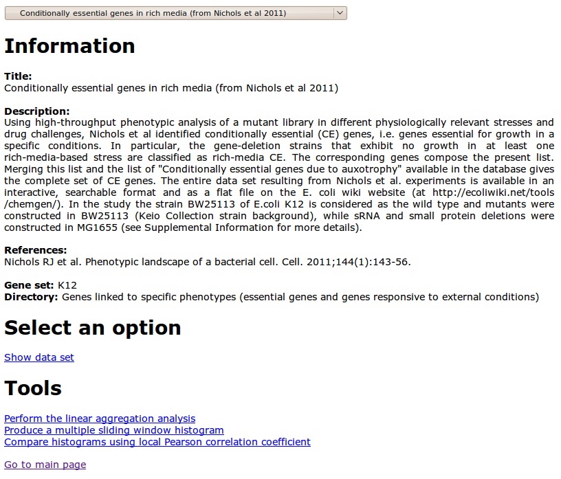
As an example, the figure below is the page corresponding to a data set in the common database
The three tools available for the analysis are connected to the links at the bottom of the page.
- All the implemented tools can be used from the Tools page (top menu).
The figure below is a snapshot of the Tools page
The following sections describe the different types of analysis and their output formats.
3.2 Linear aggregation analysis
3.2.1 Tool documentation
The linear aggregation analysis is a statistical method for identifying sets of genes belonging to a data set that show significant aggregation along the genomic coordinate. This method considers the density of genes at different scales on the genome using grids of different bin sizes, and compares empirical data with results from random null models. In order to avoid spurious effects of binning, for each gene list a density histogram is built by using a sliding window with a given bin-size. The resulting plot of the averaged density of genes for every point of the circular chromosome is considered at different observation scales of the genome, i.e. at different bin sizes of length bs in {L/2,L/4,. . .,L/2^n} where L is the length of
the chromosome. We chose n=10, as bs < L/1024 is close to the scale
of the typical gene length.
Density peaks with a significantly high number of genes are identified by comparing empirical data with 10.000 realizations of a null model. For every bin size, the null model considers the density histogram from a random list of the same length of the empirical one. The number of genes for every bin in the empirical histogram is compared to the distribution of global maxima of the null model, obtaining a P-value for the value of the empirical histogram for each bin. This procedure enables the extraction of a list of statistically significant (P <0.01) bin positions. The web server computes the null model realizations only the first time that a data set is seen, in order to avoid unnecessary computation. For each bin-size (or observation scale), clusters are defined as connected intervals containing a significantly high proportion of the genes in the list. The lowest P-value among the merged bins is assigned to each cluster. The algorithm was previously presented in ref. (Scolari et al. Molecular BioSystems 7, 878-888 2011), where additional information can be found.
The procedure for detecting one dimensional aggregation of genes can be summarized as follows.
1) A data set (gene list) loaded by the user is taken as input.
2) Using a sliding-window of fixed size, the gene density is evaluated along the chromosome.
3) A sliding-window density histogram associates to every coordinate on the circular genome the number of genes in the empirical list in an interval surrounding the point and spanning the fixed bin size. The density at each chromosomal coordinate is
compared with the P-value thresholds from the null model in order to obtain the significant positions, which are in turn merged with a
compatibility threshold of size bs in order to define the clusters. The null model calculates the absolute peaks in the gene density of randomized gene sets of the same size as the empirical one.
The three steps of the procedure are repeated for the different bin sizes bs in {L/2,L/4,. . .,L/2^n} in order to obtain the significant clusters at multiple observation scales. The results are reported in different formats as described in the following section (3.2.2).
3.2.2 Output format
The output of the linear aggregation analysis is directly visualized on the web site as two bitmap pictures and a table. The top panel shows the significant clusters for the different observation scales, with a color code representing their P-value. The plot can be saved in two alternative formats (pdf file or file in the grace plotting program format).
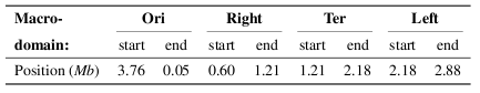
The figure below is an example of cluster diagram resulting from the linear aggregation analysis, for a data set in the common database. The x axis identifies the given observation scale (identified by the bin size of the grid) and the y axis draws the clusters as boxes, as a function of the genomic coordinate, with color coded P-values. The larger bars indicate confidence intervals, and the right panel reports the positions of chromosomal macrodomains and segments, and of a few important genes.

The cluster positions can be compared with the location of nucleoid macrodomains. The macrodomain locations are reported in the first vertical bar, as defined in the follwong references; (i) Valens et al EMBO J 23,4330-4110 2004 ; (ii) Boccard et al. Mol Microbiol 57, 9-16 2005 ; (iii) Espeli et al. J Struct Biol 156, 304-10 2006.
The exact positions used here are:
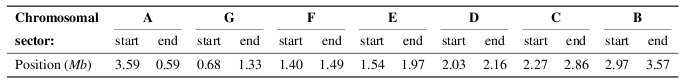
The second vertical bar indicates the coordinates of the chromosome sectors defined by Mathelier and Carbone (Mol Syst Biol 6, 366 2010), with positions:
The position of well-studied genes (such as "crp" or "fis") is also shown for reference.
A second graphical representation of results is presented in the bottom panel of the page, together with a table summarizing the results:
The statistically significant clusters are represented on the circular chromosome as colored wedges whose trasparency increases with size.
The outer colored circle represents macrodomains, while the inner colored circle contains the chromosome sectors defined by Mathelier and Carbone.
The user can change on-line the range of bin-sizes and update the image and the corresponding table.
In the table, the five columns reports respectively:
- an ID associated to the cluster (first column);
- the scale of observation (given by the number of bins) at which it is found (second column);
- the cluster start (third column) and stop (fourth column) coordinates in megabases (module the genome length 4.63965 Mb);
- the P-value associated to the cluster (fifth column).
The results can be downloaded as a pdf image, a svg (also in a black and white version),
and as a text file.
The text file is tab-separated with 5 columns with the results reported in the table visualized on-line.
Follow this link for help choosing the parameters and interpreting the results through an example.
TOP
3.3 Multiple sliding window histograms
3.3.1 Tool documentation
The sliding window histogram shows the gene density along the genome at different scales of observation. Given a user-defined window size, the number of genes falling inside the window is counted, while the window slides along the genome stepwise with step size around 500bp (smaller than the typical gene length).
Multiple histograms for different data sets can be overlaid, in order to easily visualize the presence of domains of co-occurrence or mutual exclusion.
3.3.2 Output format
The graphical output represents the number of genes located inside a window centered in each chromosomal position. The window size is fixed by the user-defined bin number.
Several data sets can be plotted together, allowing direct comparison of gene densities. It is possible to normalize the gene count (y-axes), which is useful when comparing gene lists of different length. The image below is an example of the overlaid histogram of two data sets in the common database
The color of each sliding window histogram can be selected using the menu next to the corresponding dataset name.
The output can be downloaded in different formats (pdf, grace or a text file with the raw results).
The text file is a tab-separated file with two columns.
The first column is the chromosomal starting position of the window and the second column shows the number of genes that fall inside the window.
Follow this link for help choosing the parameters and interpreting the results through an example.
TOP
3.4 Compare histograms using local Pearson correlation
3.4.1 Tool documentation
This tool evaluates the local contribution to the Pearson correlation coefficient along the chromosome between the gene densities of two input lists.
Essentially, the quantity (xi - <x>) (yi -< y >) /(σx σy) is calculated for each window position i, where xi and yi are the signals (gene densities) of the x and y data sets respectively, evaluated inside the window in position i. On the other hand, averages and standard deviations are calculated across the whole genome. Therefore, while the global Pearson correlation coefficient is a number between -1 (linear anticorrelation) and +1 (linear correlation), the local product does not have this constraint, but the number still represents a measure of positive or negative correlation. Note that the global Pearson correlation coefficient can change with observation scale, as the sliding window histograms may become different.
3.4.2 Output format
In the output plot, a black line represents the local contribution to the Pearson correlation coefficient along the genome coordinate
(x-axis) between the normalized linear densities of the two input data sets. The top-right of the plot reports the total Pearson correlation coefficient.
The window size used to calculate the gene density can be changed on-line by the user by changing the number of bins.
The figure below illustrates the output of this analysis
The output has selectable colors, and can be downloaded in different formats ( grace, pdf, black&white pdf or a text file with the raw results).
The text file is a tab-separated file with two columns. The first column is the chromosomal starting position of the window, while the second column shows the local Pearson correlation between the gene densities of the two lists inside the window.
Follow this link for help choosing the parameters and interpreting the results through an example.
TOP
4 Downloads
In the Downloads page, the user can download the following items.
- Gene ID with chromosome position: a tab-separated text file with the standard gene ID (first column), and the start (second column) and stop (third column) coordinates.
- Gene ID synonym table: a file with all the synonyms that are recognized by the web server in the form of a single-column text file listing all the pairs synonym&standardID.
- Sample input data sets: three examples of valid input lists that can be uploaded to start the analysis and test all the available analysis tools, and a README text file with all the information about the sample gene lists.
- Template access perl code:
an example of perl script that allows to query the server and download data in different formats. The script is extensively commented and can be extended to produce general codes that systematically access the web server to upload data sets, perform analyses and download analyzed data.
5 Credits
Vittore F Scolari (vittore.scolari_at_upmc.fr)
Mina Zarei
Matteo Osella
Marco Cosentino Lagomarsino
Genophysique / Genomic Physics Group
UMR 7238 CNRS Universite Pierre et Marie Curie
Paris, France
 Grant RGY-0069/2009-C Grant RGY-0069/2009-C
| | | | | | | | | | |